Recovery.com (formerly RehabPath) has a mission of helping people on their recovery journey find treatment options. We worked with their team to develop a new brand & visual identity as they went through their brand evolution from a product in the rehab category to owning the recovery space.
Branding
Visual Identity
Logo Design
Goals
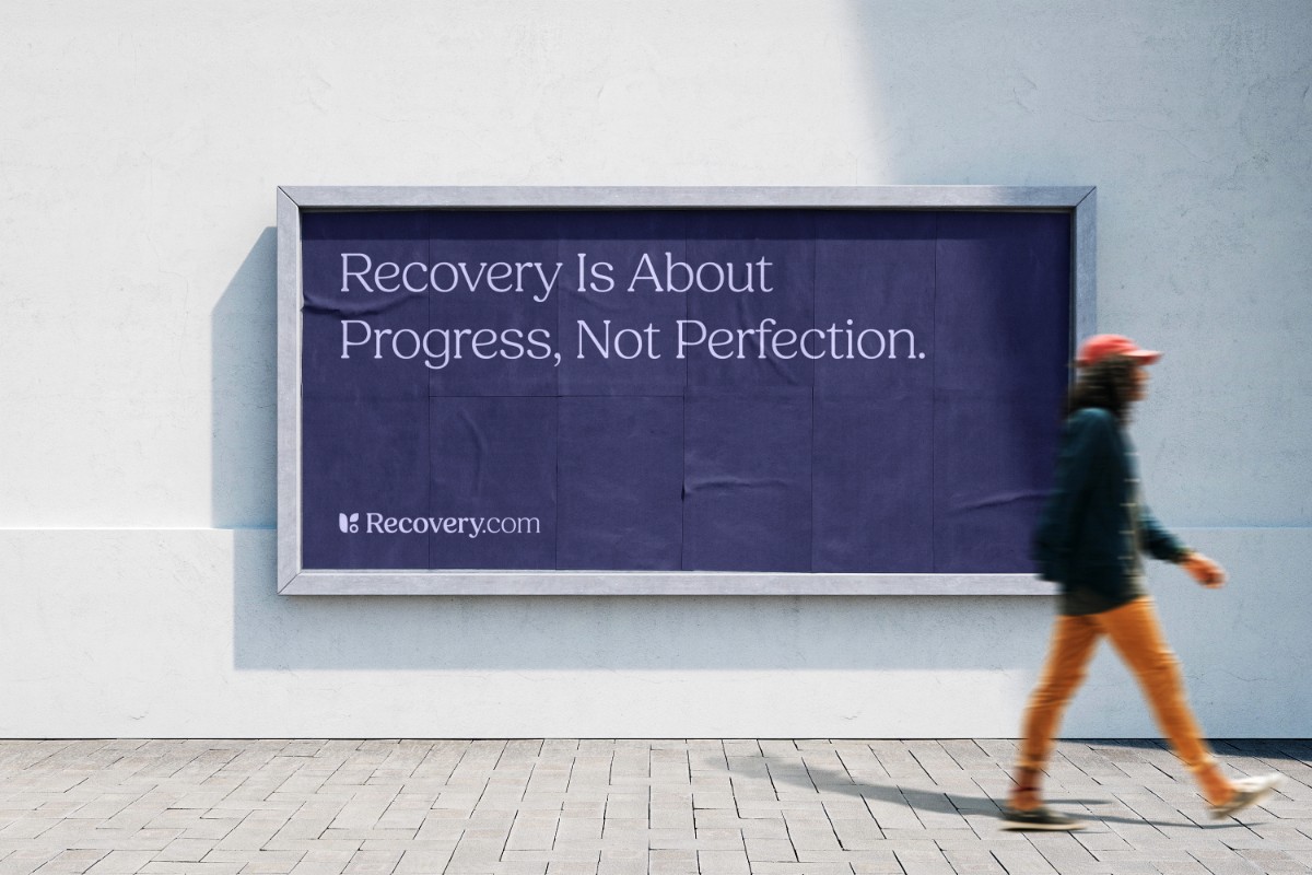
Recovery.com had a unique opportunity. They had just changed their name from Rehabpath to Recovery.com and needed to update their brand identity to reflect the change in direction.
They previously had struggled with negative connotations and narrow scope associated with the word ‘Rehab.’ Their request to us was to craft a visual identity that matched the broader and more hopeful shift of their name as they set their sights on becoming a household brand.
Discovery
To kick off discovery we conducted qualitative stakeholder interviews, customer sentiment analysis, and a brand personality assessment survey.
In doing so we discovered Recovery.com not only needed a new visual identity, but they also needed a system to handle their family of brands as well as a plan for how they would handle future acquisitions and partnerships.


Moodboard with references, competitors and inspiration from other brands
Research
We led off by working closely with the internal team to fully understand where the company had been, where they were, and where they aimed to go. This included reviewing all available resources, such as past design explorations done by other agencies.
From there, we researched competitors in their space as well as in similar industries to better understand what they were doing right—and, equally importantly, what they were doing wrong.
Design
Our approach to the visual language started with a list of concepts that told the story of what this new brand would embody. We boiled down this list to four key characteristics: growth, hope, connection, & calm.
After sketching several concepts, we identified one that had a certain spark. We began crafting a mark to further impute the core qualities we needed to embody.

Selected concept
Before
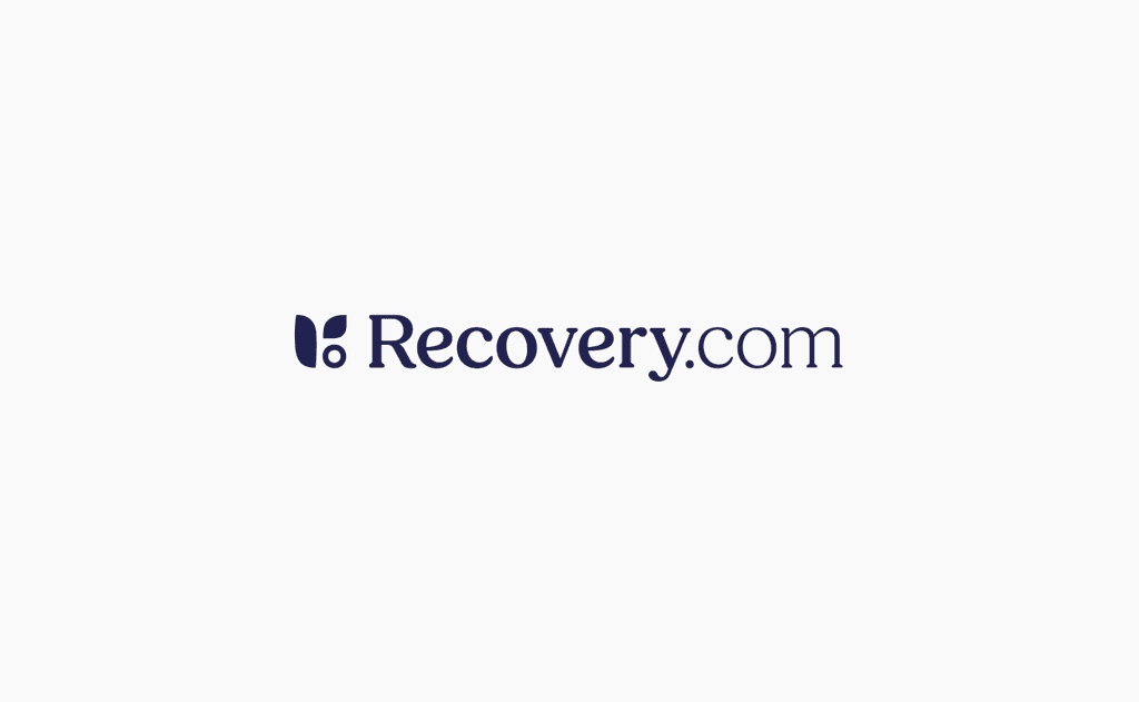
After


Refinements on the selected version
Typography re-design


Y Combinator backed?
Sign up here to register for one of our special packages.