Boostly (YC S22)
Boostly is a restaurant text marketing platform. We worked with their team to improve their onboarding flows, redesign their core app, and re-design their brand.
Branding
UX/UI
User Testing
User Research
Illustrations
Mikey Murphy
Co-Founder and CTO of Boostly (YC 22)
Denada has been so good at unexpectedly anticipating what we need. They have a perfect blend of high-quality UX, good communication, ability to run with ambiguity and work across all areas of the product pipeline. Honestly a game changer.
Goals
Boostly contacted us on to help with some general design work. Once they understood our speed that scope grew to include onboarding, branding, and their core app.
For each core need we ran a discovery process that included conducting user and stakeholder interviews. We iterated on the UX/UI (by creating raw sketches and low and mid fi wireframes), and then came back with high fidelity mockups.
+19%
Increased Net Revenue Retention
Onboarding Flow
+15%
Onboarding Flow
+22%
Increased Offer View to Redemption Rate
Main App
Onboarding & Activation
Boostly tasked us to improve the onboarding flow in order to increase activations.
To do this we led a series of interviews and then followed best practices in implementing solutions for what we learned.
Research
We led off by interviewing internal stakeholders, diving deep on onboarding processes, and shadowing and listening to customer onboarding calls.
Through these we identified two core problems to focus on: helping customers understand the product better to be bought into their launch, and reducing internal errors by standardizing the whole process.
Design System
After conducting research we created a comprehensive design system to facilitate consistency and speed while designing the rest of the product.
This helped to eliminate repetitive work and set Boostly up for success with future design hires.
The latest Figma techniques and best practices were used to make the design system as scalable, efficient, and usable as possible.
Design
Throughout the design we focused on overcoming the problems mentioned above and getting the customer to value faster and faster.
This involved many, many iterations, and turning implicit stakeholder knowledge into explicit strategic product decisions.
Navigation pattern, allowing Continue, Skip and Go Back
Calendar preview
Testing
In order to ensure our designs were accomplishing their goals we worked with Boostly to implement live Figma prototypes with real customer data into their onboarding calls.
The results were good enough that while the code was being written the entire team began using the Figma prototype to onboard clients.
Prototype in Figma used for testing

Y Combinator backed?
Sign up here to register for one of our special packages.
Branding
In addition to product design work, Boostly wanted to elevate their brand for a more successful customer perception and in preparation for raising their next round.
Process
We led a design discovery process to achieve full understanding of their brand including surveys, competitor research, and live interviews with stakeholders. We also gathered meaningful examples in the form of a moodboard to aid the creative process.
Through these exercises we helped Boostly to devise their brand values and set a foundation to build on.
Moodboard
Iterations and Final Results
With core values and moodboards in hand we iterated through several logo concepts, color palettes, and typography options.
After several rounds of feedback we crafted 3 original concepts and selected one to refine. The chosen logo shows a series of message bubbles assembled in a layout that shows a propeller in the negative space, as a way to convey the concept of Boostly being fuel for their customers. The center of the logo is a star, as a symbol of AI, which is part of their core.
Third Concept
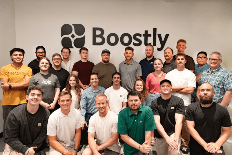
Brand application in the office wall
Brand application in the office wall
Illustrations
Once we'd solidified the brand direction we began working on a unique illustration language to add delight and aid storytelling throughout the onboarding flow.
We ended up with a language focused on:
Future & Innovation
Automation
Robots Helping Humans
Onboarding welcome animation
Login animation
Onboarding success animation
Campaign creation animation
Initial hand drawn sketches
Initial hand drawn sketches


